Visual design. Use a Bezier Curve to Move a Graphic
Use a Bezier Curve to Move a Graphic
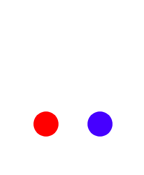
A previous challenge discussed the ease-out keyword that describes an animation change that speeds up first and then slows down at the end of the animation. On the right, the difference between the ease-out keyword (for the blue element) and linear keyword (for the red element) is demonstrated. Similar animation progressions to the ease-out keyword can be achieved by using a custom cubic Bezier curve function.
In general, changing the p1 and p2 anchor points drives the creation of different Bezier curves, which controls how the animation progresses through time. Here's an example of a Bezier curve using values to mimic the ease-out style:
animation-timing-function: cubic-bezier(0, 0, 0.58, 1);
Remember that all cubic-bezier functions start with p0 at (0, 0) and end with p3 at (1, 1). In this example, the curve moves faster through the Y-axis (starts at 0, goes to p1 y value of 0, then goes to p2 y value of 1) than it moves through the X-axis (0 to start, then 0 for p1, up to 0.58 for p2). As a result, the change in the animated element progresses faster than the time of the animation for that segment. Towards the end of the curve, the relationship between the change in x and y values reverses - the y value moves from 1 to 1 (no change), and the x values move from 0.58 to 1, making the animation changes progress slower compared to the animation duration.
To see the effect of this Bezier curve in action, change the animation-timing-function of the element with id of red to a cubic-bezier function with x1, y1, x2, y2 values set respectively to 0, 0, 0.58, 1. This will make both elements progress through the animation similarly.
<style>
  .balls{
    border-radius: 50%;
    position: fixed;
    width: 50px;
    height: 50px;
    margin-top: 50px;
    animation-name: bounce;
    animation-duration: 2s;
    animation-iteration-count: infinite;
  }
  #red {
    background: red;
    left: 27%;
    animation-timing-function: cubic-bezier(0, 0, 0.58, 1);
  }
  #blue {
    background: blue;
    left: 56%;
    animation-timing-function: ease-out;
  }
  @keyframes bounce {
    0% {
      top: 0px;
    }
    100% {
      top: 249px;
    }
  }
</style>
<div class="balls" id= "red"></div>
<div class="balls" id= "blue"></div>
공유하기
'Program & Coding/Visual design' 의 관련글
-
Accessibility. Add a Text Alternative to Images for Visually Impaired Accessibility 2021.12.11더보기
-
Visual design. Make Motion More Natural Using a Bezier Curve 2021.12.08더보기
-
Visual design. Learn How Bezier Curves Work 2021.11.22더보기
-
Visual design. Change Animation Timing with Keywords 2021.11.20더보기