Visual design. Animate Elements at Variable Rates
2021. 11. 12. 00:18
Animate Elements at Variable Rates
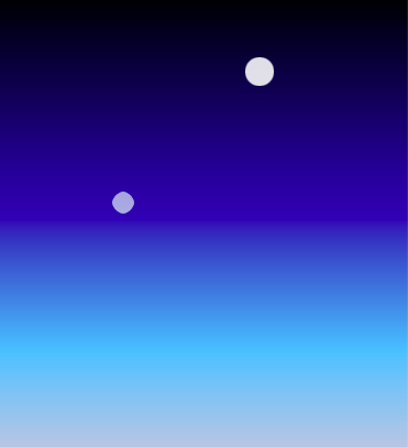
There are a variety of ways to alter the animation rates of similarly animated elements. So far, this has been achieved by applying an animation-iteration-count property and setting @keyframes rules.
To illustrate, the animation on the right consists of two stars that each decrease in size and opacity at the 20% mark in the @keyframes rule, which creates the twinkle animation. You can change the @keyframes rule for one of the elements so the stars twinkle at different rates.
Alter the animation rate for the element with the class name of star-1 by changing its @keyframes rule to 50%.
<style>
  .stars {
    background-color: white;
    height: 30px;
    width: 30px;
    border-radius: 50%;
    animation-iteration-count: infinite;
  }

  .star-1 {
    margin-top: 15%;
    margin-left: 60%;
    animation-name: twinkle-1;
    animation-duration: 1s;
  }

  .star-2 {
    margin-top: 25%;
    margin-left: 25%;
    animation-name: twinkle-2;
    animation-duration: 1s;
  }

  @keyframes twinkle-1 {
    50% {
      transform: scale(0.5);
      opacity: 0.5;
    }
  }

  @keyframes twinkle-2 {
    20% {
      transform: scale(0.5);
      opacity: 0.5;
    }
  }

  #back {
    position: fixed;
    padding: 0;
    margin: 0;
    top: 0;
    left: 0;
    width: 100%;
    height: 100%;
    background: linear-gradient(black, #000099, #66c2ff, #ffcccc, #ffeee6);
  }
</style>

<div id="back"></div>
<div class="star-1 stars"></div>
<div class="star-2 stars"></div>
공유하기
'Program & Coding/Visual design' 의 관련글
-
Visual design. Change Animation Timing with Keywords 2021.11.20더보기
-
Visual design. Animate Multiple Elements at Variable Rates 2021.11.18더보기
-
Visual design. Make a CSS Heartbeat using an Infinite Animation Count 2021.11.11더보기
-
Visual design. Animate Elements Continually Using an Infinite Animation Count 2021.11.10더보기